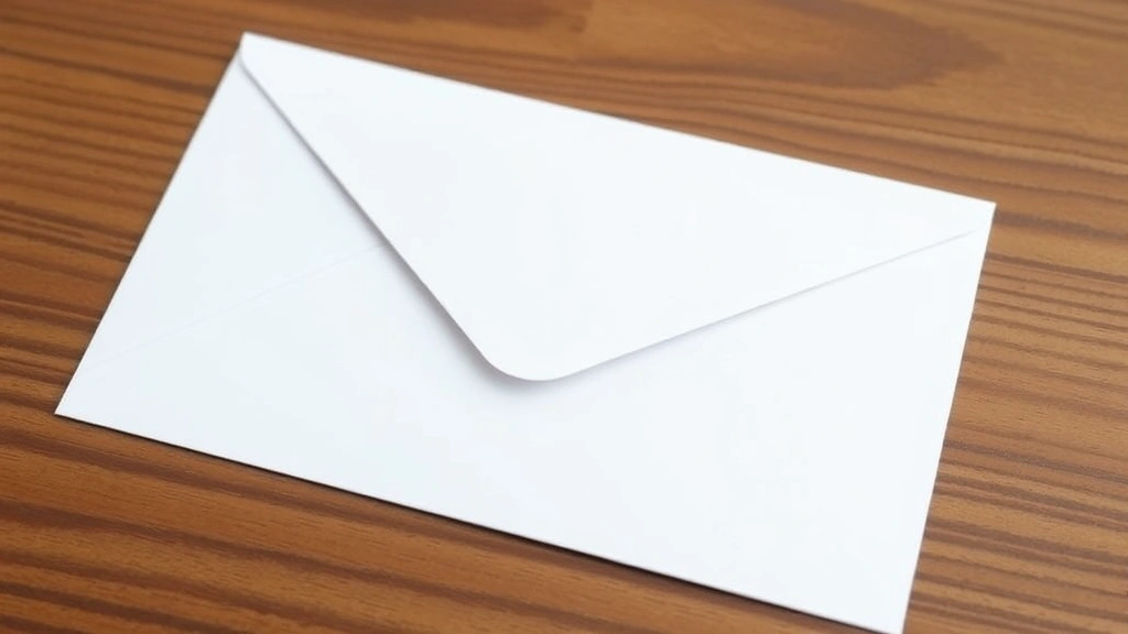
Let’s be honest—most people haven’t written a formal letter in years. Between email, texts, and digital documents, the art of envelope formatting has become a lost skill. But here’s the thing: when you do need to send a physical letter, getting the envelope right matters. Whether it’s a job application, a formal complaint, or an important legal document, a poorly formatted envelope screams carelessness. It might not even reach the right person. On the flip side, knowing how to format a letter envelope correctly takes maybe five minutes and instantly makes you look professional.
This guide walks you through every detail—from where to place the return address to which fonts work best. We’ll cover the USPS standards, common mistakes, and the small touches that separate “looks okay” from “looks like you actually know what you’re doing.”
Return Address Placement
The return address goes in the upper left corner of the envelope. This is non-negotiable according to USPS Postal Service standards. Leave about half an inch from the top edge and half an inch from the left edge. Think of it like a margin—you’re creating a buffer zone so the postal machine can read the recipient address clearly.
Your return address should include:
- Your name
- Street address
- City, state, and ZIP code
Format it like this:
John Smith
123 Main Street
Springfield, IL 62701
Use a standard font (more on that later) and keep it to 4 lines maximum. If you’re printing addresses, make sure the return address is at least 10-point font. Smaller than that and postal machines struggle to scan it. Larger than 12-point and it starts looking cramped or unprofessional.
Pro tip: If you’re sending multiple letters, consider using a return address stamp. It’s faster, looks cleaner, and saves you from handwriting the same address over and over. Just make sure the stamp is dark enough for machines to read.
Recipient Address Formatting
The recipient address is the star of the show. This is what postal carriers actually care about. It goes roughly in the center of the envelope—about 1 inch from the top and 1 inch from the left. The USPS calls this the “address block.”
Here’s the correct format:
Jane Doe
456 Oak Avenue
Portland, OR 97201
Key rules for how to format a letter envelope recipient address:
- Use all caps for the city, state, and ZIP code line. This is actually a USPS requirement for optimal scanning. It’s not just a suggestion.
- No punctuation after the state abbreviation. Write “OR 97201” not “OR. 97201”
- One address per line. Don’t try to squeeze the street address and apartment number on one line. Use two lines if needed.
- Spell out street names if possible. “456 Oak Avenue” beats “456 Oak Ave.” though abbreviations are acceptable.
If there’s an apartment, suite, or unit number, put it on the line below the street address:
Jane Doe
456 Oak Avenue, Apt 3B
Portland, OR 97201
Or alternatively:
Jane Doe
456 Oak Avenue
Apt 3B
Portland, OR 97201
Both formats work. The key is clarity. A postal carrier should never have to guess which address line goes where.
If you’re addressing a business, the format is similar but with a company name:
Jane Doe
Manager, Marketing Department
Acme Corporation
789 Business Plaza
Denver, CO 80202
Don’t make the recipient address too small. Aim for 11-12 point font minimum. This is what the postal machine reads, and if it can’t scan it clearly, your letter gets delayed or sent to the dead letter office. We’ve all heard the stories.
Font, Size, and Spacing Standards
Typography matters more than you’d think. The USPS actually has specific recommendations for envelope formatting to ensure machines can read addresses accurately.
Font choice: Stick with standard, easy-to-read fonts. Times New Roman, Arial, Calibri, or Courier New are all solid choices. Avoid decorative fonts, script fonts, or anything too thin or too condensed. If you’re handwriting, use legible penmanship. Cursive is fine if it’s clear, but blocky print is safer if your handwriting is shaky.
Font size guidelines:
- Return address: 10-12 point
- Recipient address: 11-14 point (bigger is actually better here)
- Special markings (like “FRAGILE” or “HOLD FOR ARRIVAL”): 10-12 point, all caps
Line spacing: Single-space within an address block. Leave about 0.5 inches between the return address and the recipient address. If you’re printing, this usually happens naturally if you use a template.
Color matters too. Black ink on white or light-colored envelopes is the standard. Colored text or backgrounds can confuse postal machines. Stick with black. It’s professional, it scans well, and it’s never wrong.
Choosing the Right Envelope Size
Not all envelopes are created equal. The USPS has specific size requirements, and using the wrong size can actually cost you extra postage.
Standard sizes:
- #10 Envelope (4.125″ × 9.5″): This is the most common business envelope. If you’re sending a standard letter, use this.
- #6.75 Envelope (3.625″ × 6.5″): Smaller, sometimes called a “greeting card” envelope. Works for brief notes.
- A2 Envelope (4.375″ × 5.75″): Square-ish, often used for formal invitations.
- Monarch Envelope (3.875″ × 7.5″): Slightly smaller than #10, sometimes used for formal business correspondence.
For most purposes, a #10 envelope is your default. It’s cheap, widely available, and the USPS expects it. Anything smaller or oddly shaped might require additional postage.
The envelope also needs to meet minimum size requirements. According to USPS standards, the minimum is 3.5″ × 5″. Anything smaller and postal machines might reject it. Anything larger than 11.5″ × 6.125″ and you’re in oversized territory, which costs more.
Pro Tip: When in doubt, use a #10 envelope. It’s the Goldilocks of envelopes—just right for nearly everything.
Handling Special Elements (Postage, Markings)
Beyond the basic address, there are a few other elements you might need to add to your envelope.
Postage placement: The stamp goes in the upper right corner of the envelope, about half an inch from the top and right edges. Leave enough space so it doesn’t overlap with the recipient address. If you’re using a postage meter, follow the same placement rules.
Special handling markings: If your letter needs special treatment, add markings in the upper left area, below the return address. Common markings include:
- “FRAGILE” (if contents are delicate)
- “HOLD FOR ARRIVAL” (if the recipient might not be home)
- “CERTIFIED MAIL” (if you’re sending certified)
- “RETURN RECEIPT REQUESTED” (if you need proof of delivery)
These should be printed or written in all caps, in a clear font, and positioned so they don’t interfere with the address blocks.
Attention lines: If you’re addressing a letter to someone at a business but want to make sure a specific person gets it, add an “ATTENTION” line:
ATTENTION: Jane Doe
Acme Corporation
789 Business Plaza
Denver, CO 80202
This goes above the company name in the recipient address block.
Common Mistakes to Avoid
After years of watching people format envelopes, certain mistakes show up repeatedly. Here’s what trips people up:
Mistake 1: Centering the recipient address. People often center the address like it’s a title on a document. Wrong. The address should sit in the lower half of the envelope, slightly left of center. If you’re printing, use a template. If you’re handwriting, aim for roughly the middle-to-lower third of the envelope.
Mistake 2: Using fancy fonts or colors. Your envelope isn’t a design project. Postal machines read black text on white backgrounds. If you use a colored envelope (which is fine), stick with black ink. Avoid script, decorative fonts, or anything thin and hard to read.
Mistake 3: Putting the return address on the back. Some people think the return address goes on the back flap. Nope. It goes in the upper left of the front. The back is for nothing—leave it blank.
Mistake 4: Abbreviating the recipient’s name or using initials. If you don’t know the person’s full name, find out. “J. Doe” or “John D.” is less professional and harder for postal carriers to verify. Use full names when possible.
Mistake 5: Forgetting to include the ZIP code. A ZIP code is essential. Without it, your letter might get delayed or sent to the wrong location. If you don’t know the ZIP code, look it up on USPS.com before you seal the envelope.
Mistake 6: Using a pen that bleeds or smudges. If you’re handwriting, use a ballpoint pen or felt-tip pen with permanent ink. Avoid gel pens that can smudge if the envelope gets wet. And definitely avoid pencil—it fades and isn’t official-looking.
Mistake 7: Overcrowding the envelope. Leave white space. Don’t try to fit extra information, doodles, or decorations on the envelope. It looks unprofessional and can confuse postal machines.
Printing and Digital Prep
If you’re printing addresses instead of handwriting them, here’s the workflow:
- Use a template. Word, Google Docs, and most office software have envelope templates. Use them. They handle spacing and sizing for you.
- Load the envelope correctly. Most printers have a specific way to load envelopes. Check your printer manual. Generally, you load them with the flap on top and the back facing up.
- Test print on regular paper first. Seriously. Wasting envelopes on misaligned printing is annoying. Print a test copy on regular paper, hold it up to an actual envelope, and verify alignment before you commit.
- Use a legible font. Times New Roman 11-12 point is your friend. If you’re printing the return address, 10 point is acceptable. The recipient address should be at least 11 point.
- Avoid graphics or backgrounds. Keep it simple. Black text, white background. No colored envelopes with fancy designs—postal machines struggle with that.
If you’re sending a formal letter, consider pairing the envelope formatting with proper letter formatting inside. If you’re including a signature, learning how to add a signature in Google Docs can help if you’re drafting digitally before printing. And if you’re concerned about formatting consistency, knowing how to remove formatting in Word ensures your final document looks clean and professional.
For business correspondence, some professionals prefer to send secure email in Outlook instead of printing physical letters. But when a physical letter is required, proper envelope formatting shows respect and attention to detail.
Pro Tip: If you’re printing multiple envelopes, use mail merge in Word or Google Sheets. It pulls addresses from a spreadsheet and prints them automatically. Way faster than doing them one at a time, and the formatting stays consistent.
Frequently Asked Questions
Can I handwrite addresses on envelopes?
– Yes, absolutely. Handwritten addresses are perfectly acceptable and often look more personal. Just make sure your handwriting is legible, use a pen with permanent ink, and follow the same placement rules (return address upper left, recipient address center-lower). If your handwriting is hard to read, printing is a safer choice.
What if I don’t know the exact street address?
– Look it up. Use Google Maps, the USPS ZIP code lookup tool, or call the business or organization. Sending a letter to an incomplete or incorrect address wastes time and money. A few minutes of research saves a lot of frustration.
Is it okay to use a return address label instead of printing or writing it?
– Absolutely. Return address labels or stamps are professional and efficient, especially if you send multiple letters. Just make sure the label is dark enough for postal machines to read and that it’s positioned correctly in the upper left corner.
What postage do I need?
– A standard letter (1 ounce or less) in a #10 envelope costs one first-class stamp as of 2024 (check current rates on USPS.com). Heavier letters, oversized envelopes, or special services require additional postage. When in doubt, take your letter to the post office and let them weigh it.
Can I use colored envelopes?
– Yes, colored envelopes are fine and can look professional. But stick with dark ink (black or dark blue) for the address. Light-colored text on light envelopes won’t scan well. And avoid busy patterns or backgrounds—keep the focus on the address.
What’s the difference between a business envelope and a personal envelope?
– Functionally, there’s no difference in how you format them. A #10 business envelope is just the standard size for business mail. Personal mail can use any size. The formatting rules (return address, recipient address, postage placement) stay the same regardless of envelope type.
Do I need to include my phone number or email on the return address?
– No. The return address is just your name, street address, city, state, and ZIP code. If the letter can’t be delivered, the postal service will return it to that address. Phone numbers and emails don’t go on the envelope.
What if the recipient has moved?
– The postal service has a mail forwarding system. If the recipient filed a change of address with USPS, your letter will be forwarded automatically (though it might take a few extra days). Make sure you have the most current address before sending. If you’re unsure, call ahead.
Is it unprofessional to send a letter in a manila envelope?
– Not at all. Manila envelopes are common for business mail, especially if you’re sending documents that shouldn’t be folded. They’re functional and professional. Just format the address the same way—return address upper left, recipient address center.
Can I use a computer-generated return address label that’s pre-printed?
– Yes. Pre-printed return address labels are common and look professional. They’re especially useful if you’re a business or send a lot of mail. Just make sure the label is positioned correctly and the text is dark enough to scan.